Why Redesign
The first version of Simic Systems worked. It sold product, checkout was solid, the catalog was accurate. But it looked like every other dark-mode Material UI app: default MUI components, a stock dark palette, nothing that said “this is a card shop built by someone who cares about the game.” For a store competing against marketplaces with zero brand identity, looking generic is its own kind of invisible.
So I gutted the front end and rebuilt it around an actual design system instead of a component library’s defaults.
The Design Language
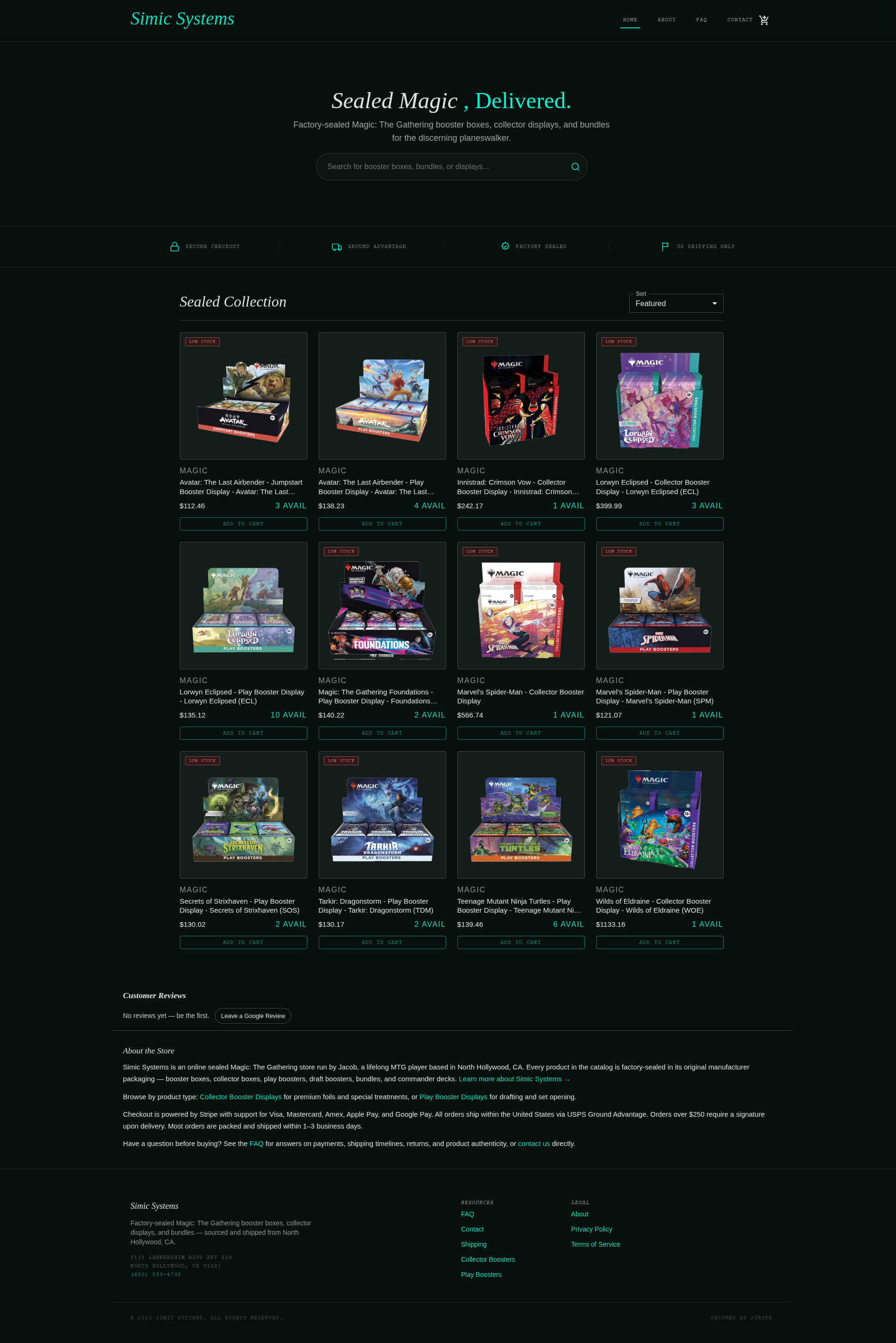
I landed on what I’ve been calling the “bio-alchemy” theme: obsidian backgrounds, a biolume-green and oceanic-teal accent pair, and typography doing most of the personality work. Headlines are set in Libre Caslon Text, an italic serif that reads more like an old-world apothecary label than a SaaS dashboard. Body copy runs in Hanken Grotesk, and anything functional, nav links, badges, prices, ships in JetBrains Mono, uppercase, letter-spaced. That mono treatment on “LOW STOCK” tags and category labels is doing a lot of the “trading card shop” signaling without a single card-game cliché in sight.
Color isn’t just a palette, it’s a full Material 3 token system: primary/secondary/tertiary roles each with fixed and container variants, surface levels from container-lowest through container-highest, on-color pairs for every role. That’s more structure than a two-person storefront strictly needs, but every teal accent, every card border, every hover state now pulls from the same fifteen-odd tokens instead of one-off hex values scattered through components, so changing the theme moves everything at once.
Rebuilding on Tailwind v4
The old site used Material UI’s component system and an Emotion-based theme object. The rebuild moved to Tailwind v4, which meant retiring the MUI dark theme in favor of CSS custom properties defined directly in global.css and consumed through Tailwind’s @theme block. Header, footer, hero, product grid, and product detail pages all got rebuilt against the new token set. It’s a bigger diff than a typical style pass, seventeen files changed, but the payoff is a design system that lives in one place instead of being negotiated between MUI’s theme provider and scattered sx props.
Product Photos, Cleaned Up Client-Side
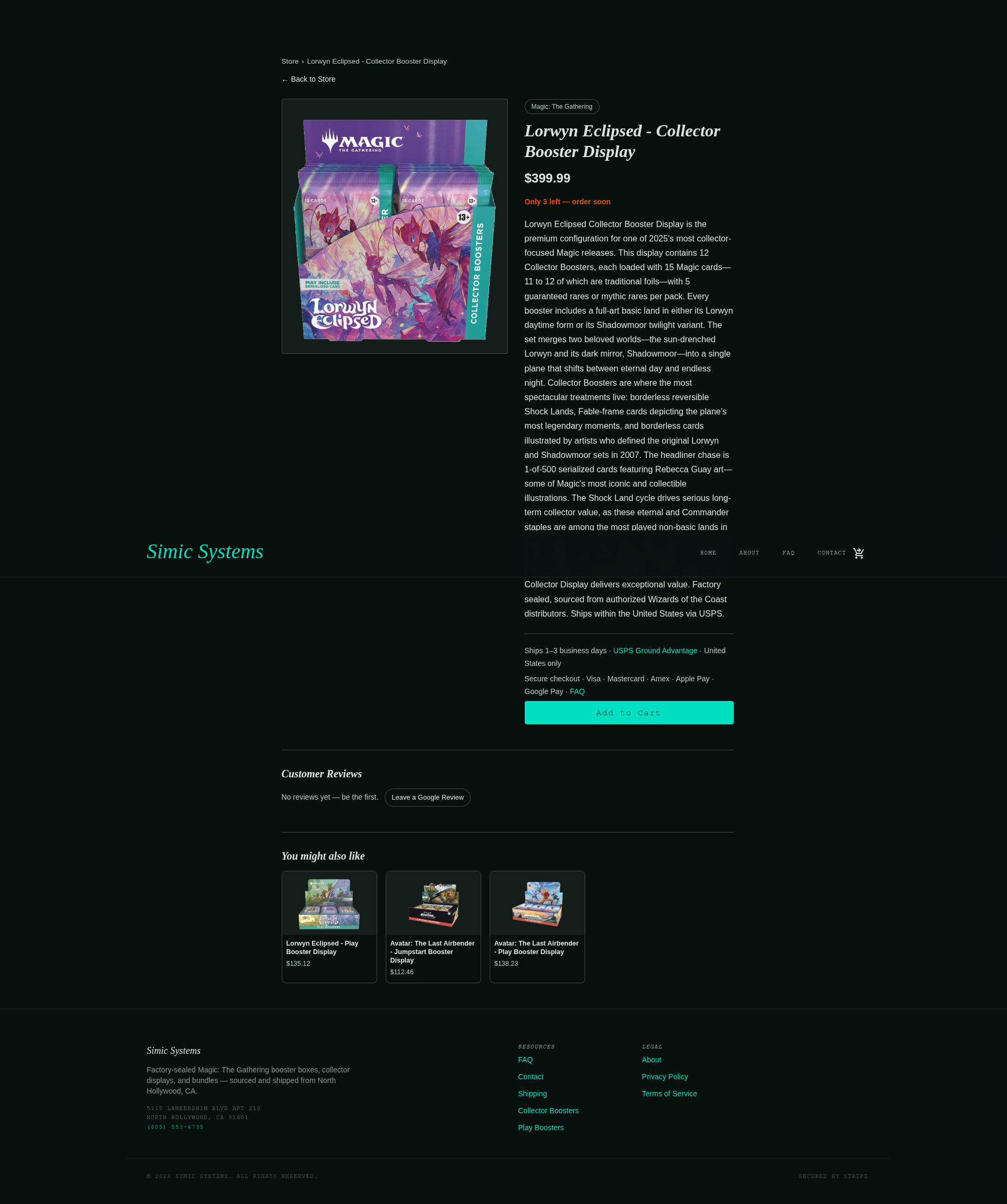
The stock photography Wizards of the Coast ships for booster boxes comes on plain white backgrounds, which looked fine on the old white-card layout and clashed hard against an obsidian one. Re-shooting or manually editing every product image wasn’t realistic for a catalog that changes with every set release, so I wrote a small canvas-based cutout routine that runs in the browser: flood-fill in from the image border to find the white background, erode the seed region a couple passes to sever thin gaps (the fanned edges of a booster stack, for instance), then grow it back out toward the true edge and feather the boundary pixels. Results get cached per image so the cost only hits once per product per session.
There’s no machine learning here, just flood fill with a couple of deliberate passes tuned against real product photos. That’s been enough to make product images sit directly on the dark background like they were shot for it.
What Changed, Concretely
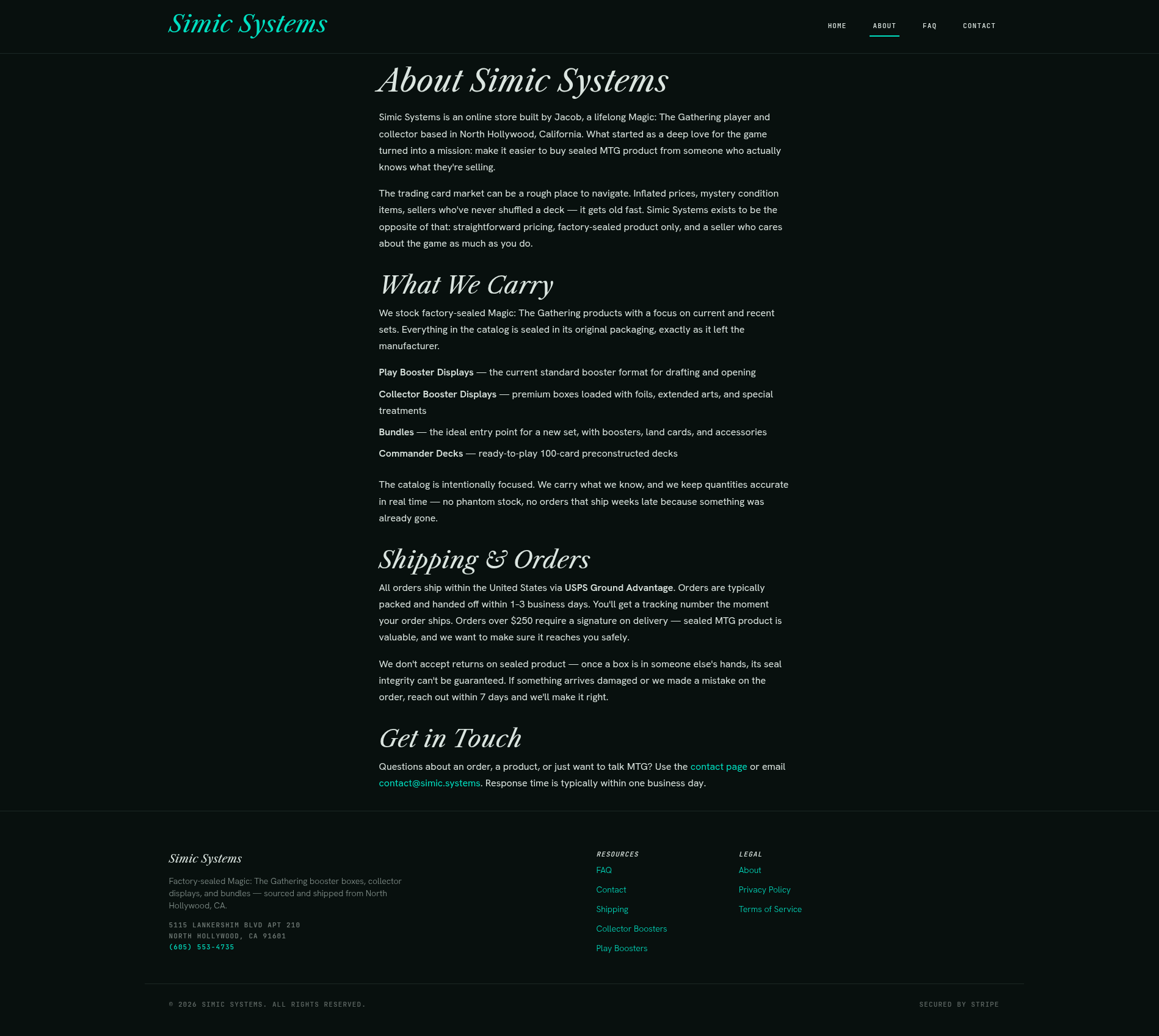
The header went from a standard MUI app bar to a slim, sticky, blurred nav with mono-uppercase links and an underline-on-active state. The footer got restructured around the same token system. The homepage hero picked up the italic serif treatment and a search bar styled to match. Product cards now show stock-level badges, category labels in mono caps, and cutout product art instead of white-boxed thumbnails. Checkout success and cancel pages, the contact form, all of it got pulled into the same visual language instead of being left in the old default styling.
What I’d Do Differently
Seventeen files and a full token system is a lot to land in one commit. In hindsight, splitting the token/theme groundwork from the component-by-component restyle would have made the diff easier to review, even against myself a day later. The white-background removal also only runs client-side right now, which means the very first paint briefly shows the white-boxed original before the cutout kicks in. Pre-processing catalog images at upload time instead of at render time is the obvious next step, and it’s already on the list.
The store looks like it was designed on purpose now instead of assembled from defaults. Take a look at simic.systems.